

LangCity UI & Branding
Creating beautiful branding isn’t easy, mais voilà
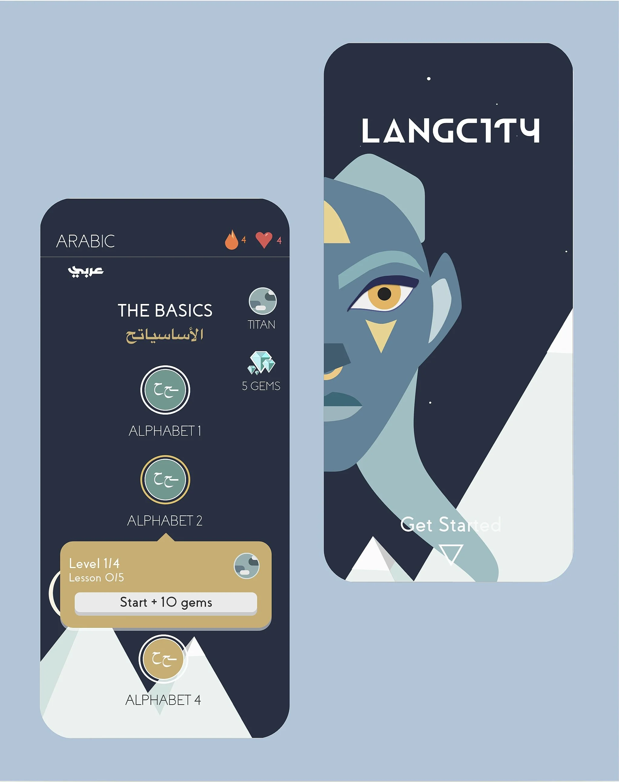
With LangCity I wanted to create a UI that was visually striking without it feeling busy. To achieve this, I had to implement clean lines, play with negative space, and be selective in my color selection. I was able to create just the environment I envisioned; a dreamlike world that was simple and had character.

A logo that shape-shifts
Creating a logo that is not only eye-catching, but one that best captures the essence of the brand I was creating, was no easy task. For the design, I played with the duality of faces to spark interest and bring a certain uniqueness to the logo. The use of duality is used to hint at the changing of “souls” or mindsets the user develops as they set out on their language learning journey; much like a metamorphosis.
Striking colors and typeface
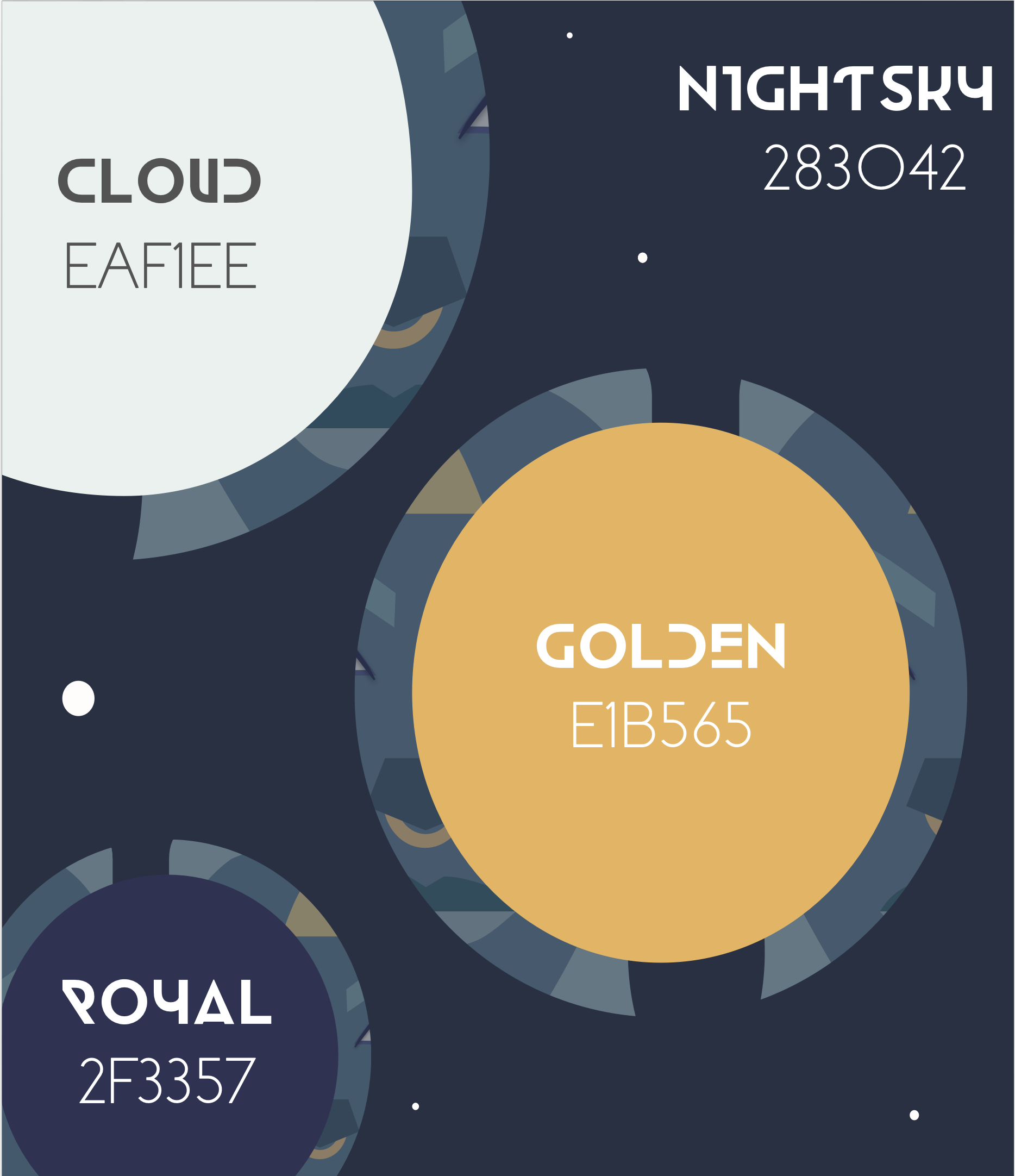
The use of dark yet warm hues of blue, purple and yellow were selectively juxtaposed against the brilliance of white to set a dreamlike mood. These colors were also picked for their psychological effect. Warm blues and yellows can exude an image of wealth, or luxury. For LangCity’s UI design I want the user to feel as though they are learning in a space that not only is conducive for learning but one that also feels rich and abundant. In terms of typeface, I used two different ones. One sans serif font with bold and heavily weight, and another sans-serif that is much less weighted yet unique.
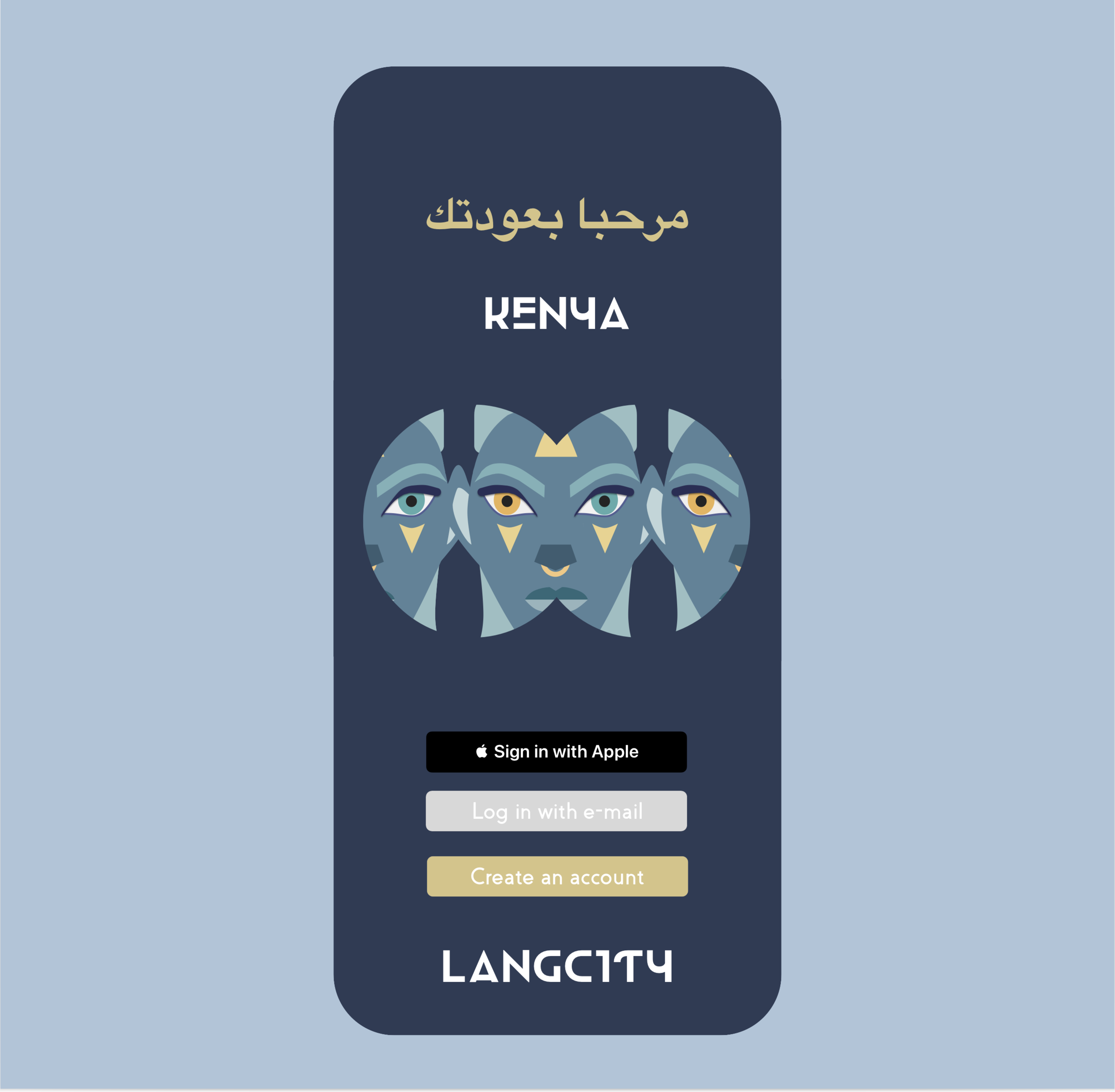
Sign in with apple
In 2021 logging into any app shouldn’t feel like a chore. Using the latest technology available, I wanted to give LangCity users the ability to sign into their account simply using their Apple ID. And what’s even better is that to do so, they can use their face.