


The Challenge: Project Overview
Most navigation apps work as they should, but sometimes, the directions they provide are not always the most clear. NavNYC is here to change that. With an intuitive new feature, getting you to your destination as simple and intuitively as possible will be the aim… always.
Project Roles:
To develop NavNYC I delved into the following concepts: UX/UI design, user research, user testing, iconography, and typography.
UI that captivates

Simple logo for a simple feature
To create this logo, I gathered inspiration from landmarks most New Yorkers would recognize, one being the obelisk at Central Park, simple and to the point.

The style guide


the Ux

Landmarks. The mapping solution you didn’t know you needed
Siri and Alexa are great, but sometimes a human element works best. With landmarks, you will feel as if you are navigating the city with a local. If you have ever received directions that sounded a bit like this, “walk down the block, and on your left you will see a coffee shop; the flower shop will be right next to it,” then you already are familiar with how this feature works. Below are examples of some of the landmarks a user can add.


Gathering the Data
Before creating NavNYC, it was imperative to gather insight into how daily New Yorkers interact with the navigation apps they already use. To gather such valuable data, I came up with an outline of several questions as part of a user interview.
“What do you enjoy or not enjoy about the applications that you use to navigate the city?
“What is it like following the directions outlined in your current navigation app?
“What are these applications missing that you think would provide a better user experience?”

User Insights
With the information that I collected from user interviews, my original idea for a landmarks feature was confirmed. Of the over 20 participants that I interviewed, 85%, or 17 of them found this idea to be a practical addition to the applications that they already use daily.
15 participants even mentioned various instances in which they could see this feature implemented, and provided various ideas to develop the feature.

Not letting the facts obscure the truth
After conducting the user interviews and collecting data, I realized that I did not have to reinvent the wheel by creating a new app. Instead, my focus shifted into creating and designing this new feature that would improve the user experience. Implementing this feature with an application that most users were already familiar with instead of changing what years of habit the user has developed, was the most logical design choice.
Understanding is key
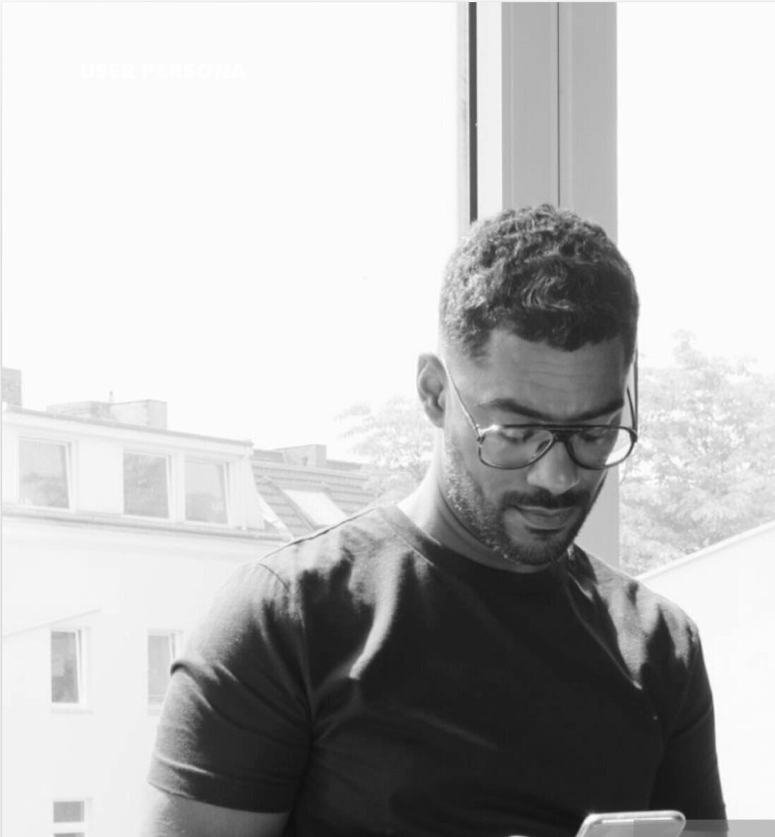
User Persona I
Who you design for matters. Meet Julien Laurent.
Julien is your average traveler and software engineer. Born and raised in Paris, he enjoys the diversity and cultural landmarks his city offers and enjoys finding the equivalent of such places abroad. Julien believes navigating a city the way its inhabitants do is the most authentic way to experience a city. Although, while not completely refraining from hopping into an Uber or Lyft, Julien prefers to get around on the metro, or by walking around, allowing him to better see the places he visits.
Julien’s Goals:
Get from point A to B quickly and efficiently
Get a better feel for the new cities and places he visits
Provide clear directions while taking the subway
Julien’s pain points:
Confusing train directions and exits that use cardinal directions
When the current location on his phone while in the subway mistakes him for being above ground
Getting lost at big subway stations with dozens of exits

User Persona II
Brooklyn Native ≠ pro navigator - meet Kyla Marsh
Kyla, a freelance illustrator, takes mass transit often to meet with clients and friends. She sees the potential for the city’s transit system to function more efficiently; but she has to rely on transit apps to tell her when her trains are delayed or not running. The main app she uses, Transit, has improved with time, but it still has a ways to go in better adapting to the constant changes, delays and re-routings.
Kyla’s Goals:
Make discovering new parts of the city fun and practical
Better navigation upon exiting a subway
Make meeting up with friends at a new park or museum easier
Kyla’s Pain Points:
Lack of signage in the subway
Long walks in subway after making a wrong turn
Running late due to the train, or due to an application that takes long to update current train status.
A design metamorphosis

Humble beginnings
No app design starts off perfect, many iterations of the design and rough sketches needed to happen before arriving here at the final product. From pen and paper to mid-fidelity wireframes most of my early wireframes appeared like the one above.

Bringing it together
It all begins with an idea. Maybe you want to launch a business. Maybe you want to turn a hobby into something more. Or maybe you have a creative project to share with the world. Whatever it is, the way you tell your story online can make all the difference.

the prototype
The takeaways
At the end of this project, I have come to realize that creating good design is no an easy task. It takes a lot of research, iterations, and going back to the drawing board to truly strike upon a design a user would find enjoyment using. And although my original intention with this project was to designer a new application from the ground up, I noticed the need to change that. Instead, I noticed that perhaps implementing a new feature to an already existing and frequently used application like Apple Maps, would prove even more valuable. With creation of this new feature, came the need to stay true to the design and feel of the existing application, but also the need to figure out how to make this new feature interact seamlessly and without much distraction. Striking this balance, took lots of time, but I know that developing various iterations of the design, only helped me arrive at this final design you see today. I have not learned a great deal about the design process more in depth, by learning how to better interact with users, and become a better more polished designer. I create things I wish existed in real life... and maybe soon I can make this feature design a reality.